
Building forms
A Figma-style editor for multi-step forms — layers, canvas, inspector, live preview, versions, and keyboard shortcuts.
The builder is where you shape a form. Open any form from the Forms list to edit it. It works like a design tool: select things on a canvas, edit them in an inspector, and preview exactly what shoppers will see.
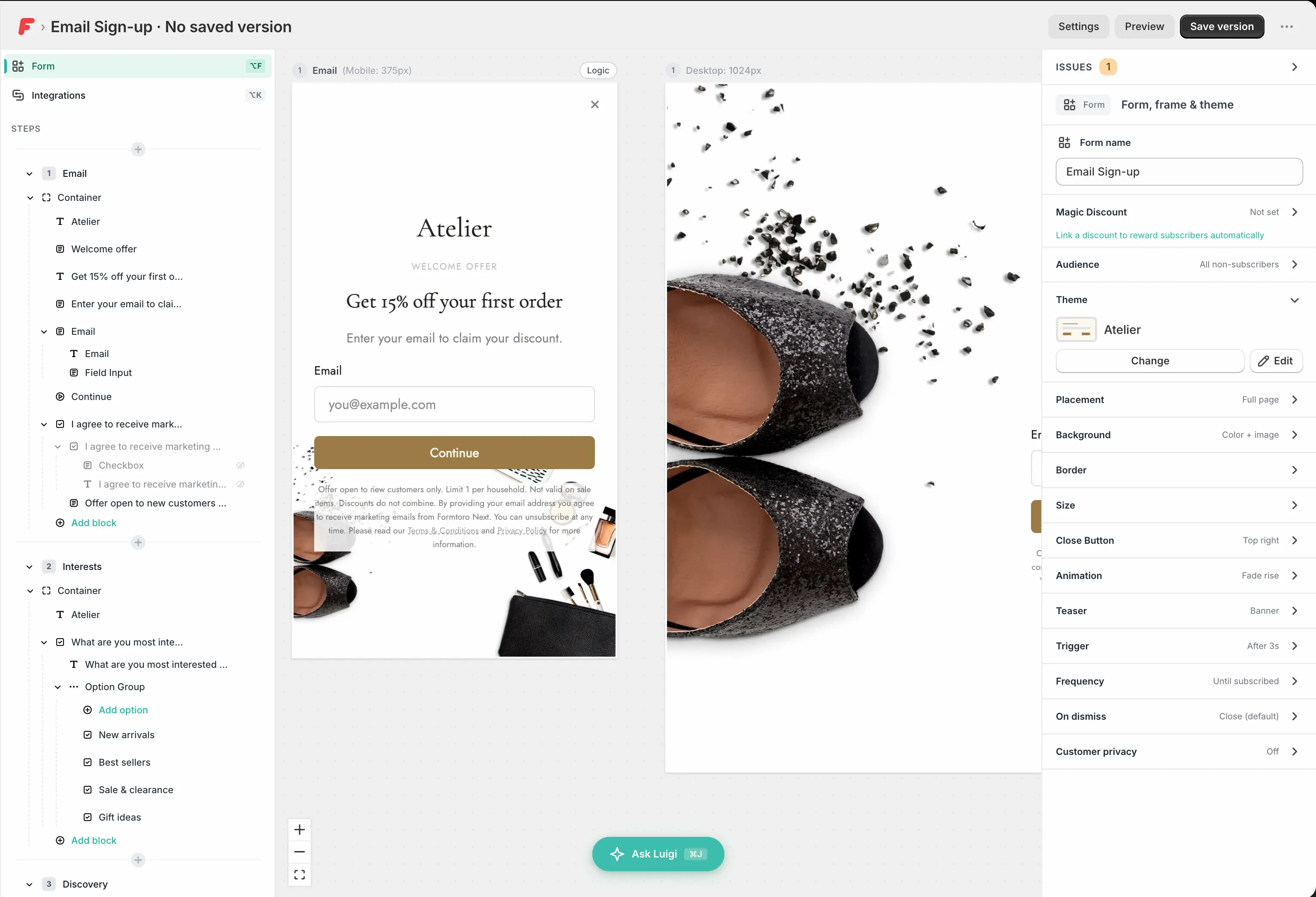
The three-panel layout
- Left — Layers. A tree of every step and element in the form. Click to select, drag to reorder, and use the inline + to add elements from the block picker. Elements can be hidden or locked from here (locked elements can't be edited, moved, or deleted until unlocked). Parts of a field — like its label and input — are shown nested under it.
- Center — Canvas. Every step laid out side by side, rendered exactly as the live form renders. Zoom and pan freely: ⌘0 fits all steps in view, ⌘1 zooms to the selected step.
- Right — Inspector. Edit whatever is selected: content, styling, validation, and visibility. A breadcrumb at the top shows where the selection sits in the tree — click any segment to jump to that ancestor.
Selecting things
Click an element to select the deepest thing under your cursor — click again to cycle the selection up to its parent. Escape walks the other way out: finish text editing → select the parent → deselect the element → deselect the step. ⌘↑ / ⌘↓ step the selection through the tree element by element.
Adding elements
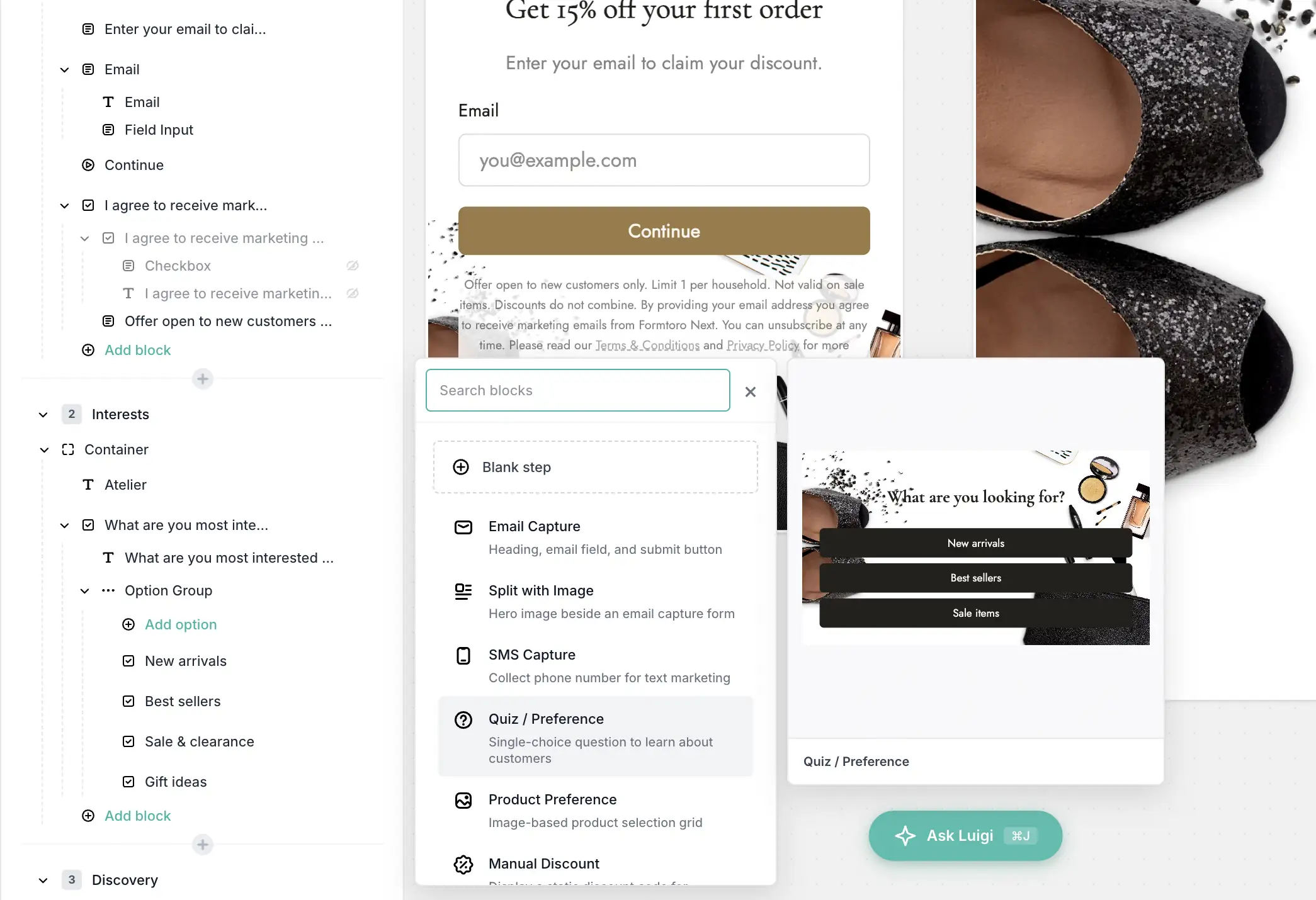
Add elements from the block picker — via the + in the layers panel or by dragging a block straight onto the canvas. Blocks are grouped as:
- Form fields — text, email, phone, text area, date, single choice, dropdown, image choice, and consent. (Choice fields can be switched between single- and multiple-select in the inspector.)
- Content — headings, text blocks, and images.
- Layout — containers and spacers to arrange everything.
- Actions — the submit button and a discount display element. (The close button isn't a block — it's part of the form's chrome, configured in the Form settings.)
See the fields reference for what each block does and what you can configure on it.
Start a step from a template
Instead of assembling a step block by block, pick a pre-built one from the step templates palette — email capture, survey questions, discount reveals, feedback prompts, and more, grouped into Capture, Engagement, Conversion, and Feedback. Applying a template replaces the selected step's content, so use it on a fresh step.
Editing on the canvas
Text is edited in place. Select a heading, text block, label, button, or
choice option and press Enter (or double-click it) to start typing right on
the canvas. A formatting toolbar appears for rich text, merge tags like
{{shop_name}}, and policy links. Press Escape when you're done.
Right-click for quick actions. The same context menu is available on the canvas and in the layers panel:
- Duplicate and Delete
- Show / Hide and Lock — unlock again with the lock icon in the layers panel (locked elements can't be edited or right-clicked until then)
- Wrap in container — group elements to arrange them side by side or float them
- Add label on fields, Add item on choice fields
Working with steps
Forms can be multi-step. Each step is one screen the shopper sees — keeping a single question per step tends to lift completion rates: ask one thing, then move on.
- Add, duplicate, reorder, and delete steps from the canvas or the layers panel. Alt+1–9 jumps straight to a step.
- Select a step to edit its settings in the inspector: its name, its background, its visibility, and its logic.
- A thank-you or success screen is just a regular step at the end of the flow — route to it with the submit button or the logic engine.
Check your work
Two tools, two jobs:
- Breakpoint toggle (on the canvas) switches a step's editing view between Mobile, Tablet, and Desktop so you can fine-tune each breakpoint while you edit.
- Preview (title bar, or ⌘P) opens an interactive preview you can actually click through — validation, step routing, and animations all run. It renders with the same engine as the live widget, framed in real devices: iPhone SE, iPhone 15, iPad, Desktop, and Desktop Large. What you see here is pixel-for-pixel what shoppers get.
The issues panel
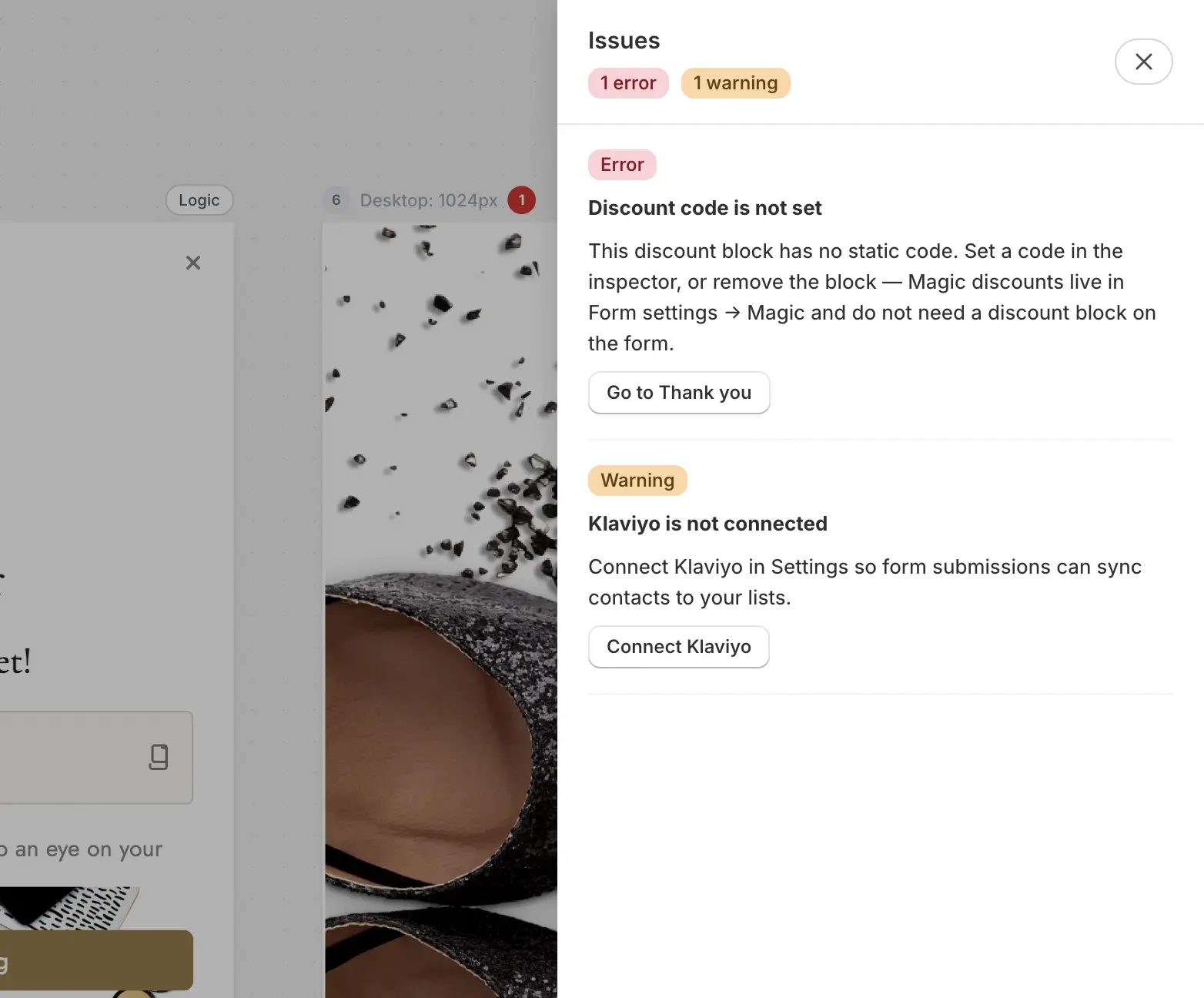
The builder continuously checks your form and flags problems before they reach shoppers — a missing email consent disclaimer, a discount code that doesn't exist in Shopify, a step with no way forward, content that may overflow on mobile, conflicting discount setups, and more. Open the issues panel to see each flag with an explanation and, where possible, a one-click fix.
Blocking issues also appear in the checklist when you save a version, so nothing critical slips into a live release.
Saving, versions, and going live
You never lose work in the builder — and you control exactly what goes live:
- Your draft autosaves continuously. Toasts confirm Saving... and Changes saved, and warn you on Save failed, Offline, or when the form was modified elsewhere (say, by a teammate).
- Save version (the primary title-bar button) snapshots your draft as an immutable version. The save dialog runs a readiness checklist and writes a changelog of what changed since the last version. If the form is on, saving updates the storefront immediately — the button reads Save and update live, so treat it as a deploy. If the form is off, the version saves quietly and Formtoro then asks whether you want to turn it on.
- Turn on / Turn off flips the form live or off without creating a new version. The form's badge shows On, Off, or Draft — plus Paused — limit reached if your plan's monthly submission limit is hit while it's on.
- Version history (⌘⇧H) lists every version with its changelog and a Live badge on the active one. Restore this version copies an older version back into your draft — the storefront doesn't change until your next Save version.
Going live also depends on your theme setup — see Going live for the app embed, launch buttons, and the "why isn't my form showing?" checklist.
Keyboard shortcuts
On Windows, use Ctrl for ⌘ and Alt for Option.
| Shortcut | Action |
|---|---|
| ⌘S | Save the draft now |
| ⌘Z / ⌘⇧Z | Undo / redo |
| ⌘D | Duplicate the selected element or step |
| Delete | Delete the selected element or step |
| Enter | Edit the selected element's text in place |
| Escape | Finish editing → select parent → deselect |
| ⌘↑ / ⌘↓ | Move the selection through the element tree |
| ⌘0 / ⌘1 | Fit all steps in view / zoom to selected step |
| Alt+1–9 | Jump to step 1–9 |
| ⌘P | Toggle the interactive preview |
| ⌘⇧H | Open version history |
| ⌘J | Open Ask Luigi |
| Alt+F / Alt+K | Jump the inspector to Form / Integrations scope |
Form settings at a glance
The Settings button in the title bar opens a tabbed sheet covering how the form behaves on your storefront: Trigger, Teaser, Frequency, Dismiss Behavior, Audience, and Discount. The inspector's Form scope covers its appearance: placement (popup, slide-in, full page, or inline), size, background, border, close button, animation, and theme.
Each has its own guide:
- Display modes & triggers — how and how often the form appears.
- Audience filtering — who is eligible to see it.
- Discounts — reward shoppers for completing it.
- Themes & styles — keep every form on-brand.
Editing with Luigi
You don't have to do any of this by hand. Open Ask Luigi (⌘J) and describe what you want — "Add an email step with consent", "Make the button teal", "Add a discount after the survey." Luigi sees what you have selected — the drawer shows Editing: … for the current element or step — and scopes its edits accordingly. Every Luigi edit can be undone with one click. See Luigi, your AI assistant.
Next steps
- Fields reference — every block you can place.
- Layout & responsive design — containers, side-by-side layouts, and per-breakpoint tuning.
- Logic engine — branch between steps and route shoppers based on their answers.
- Going live — get the form rendering on your storefront.